After choosing your template, follow the instruction below to learn how to set up and design your new Landing Page template.
The name you type here will be shown in the browser's title bar. Your website visitors will see this, so make sure to choose a name wisely.

We utilize a layout system that is built upon layers. These layers are:
Section - The foundational layer to your content. Every other layout element sits on top of a section. The image below is an example of a Hero Section.

Row - A horizontal layout element. You can add multiple rows in a section. The hero section below contains 3 rows: The top row shows the social media icons (in the top right), the Hero text is currently highlighted in the middle, and there is a new row at the bottom that hasn't been configured yet.

Column - A vertical layout element that sits inside a row and contains an element within it. You can add multiple columns in a row. Note the new row that I added has 3 columns

Element - Sits inside a column. You can only add one element in a column. Elements include Text, Image, Buttons, etc...

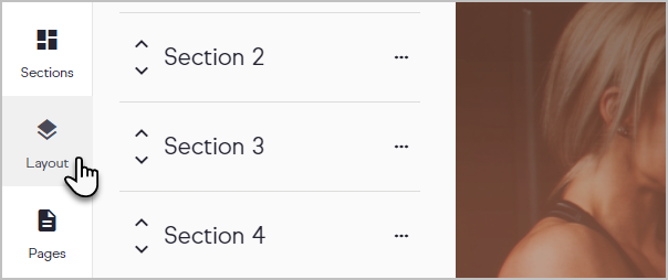
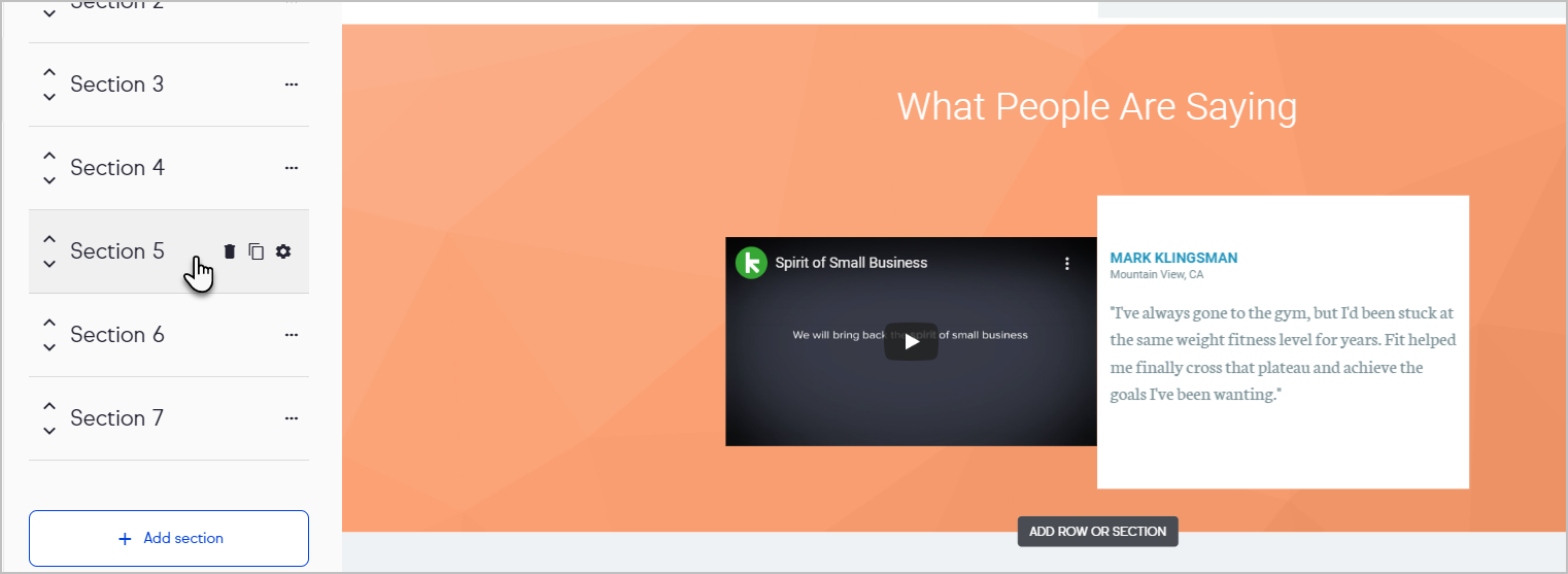
Click on Layout to navigate and modify your layout by adding sections, rows, columns and elements to your landing page template.

As you hover your mouse over each layout element, the editor will scroll to that element.

Click on an Element to configure it. Choose the element type from the left side of the page and drag it over. Let's add an image element in the bottom row of our Hero section. Note how the configuration panel slides out from the right side of the page when our new element is selected.

You should now understand the basic structure of a Landing Page. In the next article, you'll understand a bit more about how to manage the color scheme throughout your Landing Page.
Note: Not all custom fields may be used on a Landing Page. Reference this help article for lists of custom fields that can and cannot be used on a Landing Page.
Additionally, mobile devices currently don't support the background parallax Style option.

